
How to write an About page that builds trust (with a simple template)
A practical structure for writing a small business About page that feels human, builds trust and gently leads visitors to get in touch.
Read articleWebsites
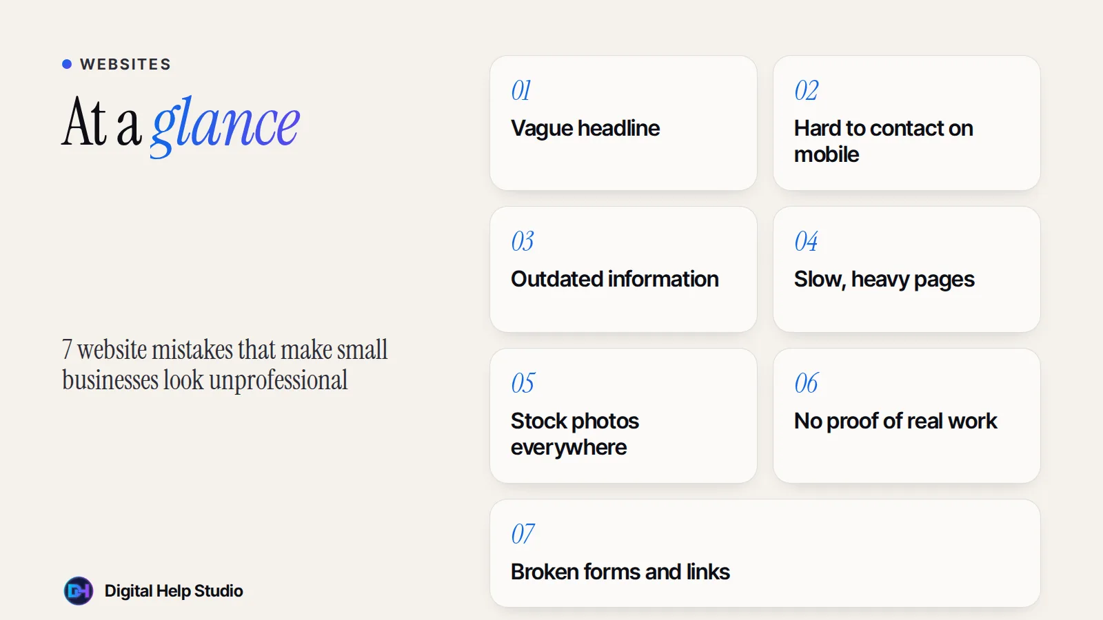
Visitors judge your business within seconds. These seven mistakes are common, easy to miss when you see your own site every day, and usually easy to fix.
“Welcome to our website” or “Excellence in everything” tells visitors nothing. Fix: say what you do, for whom and where, in one plain sentence.
Tiny text links, no call or WhatsApp button, or a contact page hidden in the footer. Fix: add clear, tap-friendly buttons near the top of key pages and a simple contact page.
Old prices, last year’s offers, wrong opening hours or a copyright year from years ago make people wonder if you’re still in business. Fix: review your site every few months, and keep details consistent with your Google Business Profile.
Huge images, autoplaying videos and piles of plugins make pages crawl on mobile data. Fix: compress images, remove what you don’t need, and test your site on a real phone.
Smiling models in suits don’t build trust for a local bakery or a freelance consultant. Fix: use real photos of you, your team, your space and your work — even good phone photos are better than generic stock.
No examples, no reviews, no explanation of your experience. Fix: add real project examples, genuine reviews (with permission) and a short, honest about section. Never invent testimonials or numbers.
A contact form that silently fails is one of the most expensive mistakes a website can make. Fix: test every form, button and link regularly — and check the spam folder when you test.
Pop-ups, sliders, flashing banners and ten different fonts make a site feel chaotic. A calm, consistent design with clear spacing looks more trustworthy.
Want a fresh start? I design clean, fast small business websites and I’ll show you a free demo of yours first. For more fixes, read how to get more enquiries from your website.
Custom, hand-coded websites and landing pages for small businesses, starting with a free personalised demo.
See the service
Brijaditya Sharma is the founder of Digital Help Studio. After nine years in-house handling content distribution for an Indian brand, he now builds websites and runs digital marketing for small businesses worldwide. Connect on LinkedIn.
Often not. Many of these fixes are content and settings changes. A redesign makes sense when the structure itself is holding you back.
Check key information every few months and whenever something changes in your business.
Not necessarily. A well-chosen template with real content and photos can look professional. Problems start when the template hides what makes your business different.
Keep reading
A practical structure for writing a small business About page that feels human, builds trust and gently leads visitors to get in touch.
Read article
Instagram is great for discovery, but it isn’t yours. What a website does that social media can’t — and when you might not need one yet.
Read article
The five essential pages, useful extras and a pre-launch checklist — a practical guide to planning a small business website.
Read articleYour next step
Send me your business details or your Instagram link. I’ll build a free, personalised website demo — no payment, no obligation.